
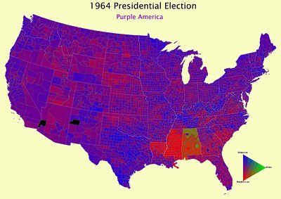
This interesting series of graphics shows the red and the blues of Presidential elections through the years, county by county through the years, from 1960 to 2004. It take a little while to load, but is worth the wait-- you can zoom in to see the counties a little better if you like.
No comments:
Post a Comment